Friday, December 28, 2012

Top 5 Posts in 2012


 Of the 42 posts published here in 2012 these are the most searched, visited, and read:

5. Back to Go A painting inspired by El Matador State Beach in Malibu and about the potential California State Park closures that we managed to avert - yay!

4. Creation is Subtraction “Creation is not capricious or random addition; it is intelligent and selective subtraction.” The God Theory: Universes, Zero-Point Fields, and What's Behind It All, Bernard Haisch

3. Can Artwork Make You Cry?  The answer is yes. It can also make you feel angry, seasick, energized, elated, and more.

2. Thinking About the Third Thing D.H. Lawrence's non rhyming quote. What is the 'Third Thing'? I'm still wondering....

1. Art.sy Experience A browsing session on Artsy's enormous art genome website. Have you visited yet?


Monday, December 17, 2012

The Third Space

In addition to Ma, Notan is another design principle to think about. Also a Japanese term, Notan refers to the interplay of dark and light. For artists it is something to bear in mind for composition and value. While considering the layout of a work, Notan is part of the decision to break up the space with interesting shapes, and to balance the darks and lights in a pleasing way - or a disturbing way, if that’s
what you’re after.


One way to check a composition is to reverse your image. The inverted values help in seeing in an abstract way if the shapes are interesting and if the darks and lights are balanced.

 
Metaphorically, Notan is a combination of presence and absence. The two, by nature of their dynamic opposition, create tension, and a mysterious, transcendent, ‘third space’ is evoked.

Monday, December 10, 2012

Reserving Space

drawing, Sky, Rocks, Beach, atmospheric, clouds
Sky, Rocks, Beach sketch Katherine Kean
graphite

Have you ever experienced 'the Gap', the space between thoughts when the mind is still?They say that when no thoughts distract you, you can experience present moment awareness, and from cultivating present moment awareness, inner wisdom and joy arise.

drawing, Cuds, beach, sky, water, atmospheric, Ma
Clouds Over Water sketch Katherine Kean
graphite

 There is a Japanese word, "Ma," which translated means "gap", "space", "pause" or "the space between two structural parts" and is experienced through progressive intervals of spatial designation. It is an awareness of place as the simultaneous awareness of form and non-form and happens in the mind of the viewer.

Monday, December 03, 2012

A Painting Moment: Video Interview


A Moment with Katherine Kean from Aaron Landman and Joe Gasparik on Vimeo 

This video interview was shot this summer when friends Aaron Landman and Joe Gasparik came to the studio in the September heat and set up their equipment; fitting camera, lights, and recording gear wherever they could between wet canvases , flat files, and easel. From sketching to painting, peeking over my shoulder and close up on the palette they went about capturing thoughts about my painting process along with a behind the scenes look inside my studio.

Bear was also on hand - mostly sleeping and otherwise on good behavior. You can catch a glimpse of him keeping watch in the background.

Monday, November 26, 2012

Have you ever wondered: who does the remembering?

Marsh Labyrinth 2, Great Marsh, Cape Cod, drawing
Cape Cod Great Marsh Sketch/Marsh Labyrinth 2 Katherine Kean
graphite on paper 6 x 6 inches

Our physical bodies are entirely replaced by every seven to ten years - some parts sooner. Surface skin is replaced every two weeks or so, the stomach lining in 5 days, the liver 300 - 500 days and the skeleton in seven 
to ten years.

So, who remembers? What part of a person stores the memories of people, places, and things from youth? 

Marsh Labyrinth 3, Great Marsh, Cape Cod, drawing
Cape Cod Great Marsh Sketch/Marsh Labyrinth 3 Katherine Kean
graphite on paper 6 x 6 inches
It has been suggested that when drawing and painting from memory that it may be better to observe intensely and then do the 'transcribing' back in the studio. A famous art teacher, Lecoq de Boisbaudran,  instructed his drawing students to visit the Louvre to carefully study a painting in order to reproduce it from memory later. This would develop observation and memory skills, as well as help the student to discover their own visual language.

Monday, November 12, 2012

Any proverbs about weather....

... are doubly true during a storm. 
~Ed Northstrum

Katherine Kean, raindrops, contemporary landscape painting, atmospheric, wet weather
I Stop for Drops 2012 Katherine Kean
(work in progress) oil on linen 12 x 16 inches

Here's a progression from drawing through details.


As you can see I ended up with much more description of the background and less focus on the drops.


Above are the first three (or so) layers from a beginning coral/pink, next a minty, pale green, and then shapes suggested in transparent brown tones. I could almost have begun with the drops at this stage, however I got carried away.


It was so much fun painting the distant urban landscaping, the trees, and the car that I just kept on going.


When I got around to adding the drops I worked from left to right, only working with the largest shapes at first.


This is what it looks like close up.

I'm undecided now. I can just finish this up with a few more glazes, or I may decide to paint over the bottom, this time taking away detail, or perhaps paint an alternate version. I'm not sure - what would you do?


Monday, October 29, 2012

Fall News


My late fall newsletter emailed today. Did you get it? This one links to a first look at a short video interview in my studio. Sign up below if you'd like to receive it:


For Email Marketing you can trust


Monday, October 22, 2012

City Hopper, Country Hopper

Road in Maine Edward Hopper
When you think of Edward Hopper’s work do you visualize urban scenes or country views?

He painted both, and stillness, solitude, and light were themes in all of his work.

It may be my own personal bias, but I get very different feelings from looking at his work in each setting. His cityscapes seem to see the architecture as a barrier. The solitude of the figures evoke a sense of loneliness.

“My aim in painting has always been the most exact transcription possible of my most intimate impressions of nature. “ is Hopper’s statement from a 1959 interview with John Morse at the Whitney.

 Another quote from the same interview,  “There is a certain fear and anxiety and a great visual interest in the things that one sees coming into a great city. I think that’s about all I can say about it.”

Manhattan Bridge Loop Edward Hopper


Monday, October 15, 2012

Sometimes in Marshes

Katherine Kean, drawing, the great marsh, cape cod, halfway house, graphite, nature
House on Great Marsh ©2012 Katherine Kean
graphite  6 x 6"

“We need the tonic of wildness, to wade sometimes in marshes where the bittern and the meadow-hen lurk, and hear the booming of the snipe; to smell the whispering sedge where only some wilder and more solitary fowl builds her nest, and the mink crawls with its belly close to the ground.” Henry David Thoreau 


Bitterns are wading birds of the heron family. They have shorter necks then herons and are shy. Snipes are also wading birds. I don't recall ever hearing them boom, although if I did I might not have known what it was. I'm told it is a drumming sound that they make with their tail feathers.

Another sketch, the Great Marsh in Cape Cod, and a house that is there. I'm not sure, it may be The Halfway House as it's called, for being halfway down the trail. I wasn't near enough to read any signs or plaques. The Halfway House is owned by Barnstable and used by groups from time to time. It looks like a wonderful place to go to draw and paint the marsh.


The Great Marsh is an excellent place to get a little taste of some wildness.


Monday, October 08, 2012

Forever Close, No Matter How Far


 I use a reduction glass in the studio, on medium and large paintings – as I've mentioned before – it saves both time and energy and gives me a fresh take on work much as using other methods, such as squinting, or a mirror, and so on.

Another useful tool is a magnifying glass. This can be used in the studio to check your own work, and I like to keep a pocket size one with me to look closely at details on artwork in galleries and museums. It is amazing to me what I learn this way.

 I recently saw an exhibition of Linden Frederick’s work – a collection of 6 inch squares of small towns and back roads seen at dusk. Realistically rendered landscapes, a few depict a solitary home or building, in which one can see tiny luminous reflections in the ¼ inch rectangles of a window pane. As these minute areas reflected the space behind the viewer, it had the effect on me of feeling right in the middle of the space even as experiencing a remoteness – as if I were an invisible giant. The magnifier revealed beautiful paint handling in even the very smallest sections. The experience I took away was of having walked around within a tiny painting as if I were also tiny and being able to step back and become huge and knowing, aware of the contents of the ‘scene behind me’ based on my glimpses at the reflections.


Thursday, October 04, 2012

Billows Upon Billows

Scotland: Clouds, Hill, Field  ©2012 Katherine Kean
graphite and charcoal 6 x 6"
"Clouds are not spheres, mountains are not cones, coastlines are not circles, and bark is not smooth, nor does lightning travel in a straight line." Benoit Mandelbrot, in his introduction to The Fractal Geometry of Nature. 

I'm working out some painting ideas inspired by last fall's visit to Scotland, working in six inch squares in graphite and charcoal. Drawing in this small scale makes it easier to simplify shapes and clarify values, while still having room to enjoy some details. That is part of the fun of clouds, isn't it? The "billows upon billows upon billows" as Mandelbrot would say.

Scotland: Clouds, Hills, Valley   ©2012 Katherine Kean
graphite 6 x 6"

Monday, September 24, 2012

"Poetry and Progress Are Like..."


"....two ambitious men who hate one another with an instinctive hatred, and when they meet upon the same road, one of them has to give place."  Charles Baudelaire

Do you ever feel like that?

Here's the progress of two Chatham Beach paintings starting with the underpainting and the first layers of color:


More color added and some detail:


Almost finished, waiting to dry for the final glazes:


Thursday, September 13, 2012

Details, Details, Details

"It's the little details that are vital. Little things make big things happen." John Wooden

Detail of Wave triptych work in progress  ©2012  Katherine Kean   

Charles Eames said "The details are details. They make the product. The connections, the connections, the connections. It will in the end be these details that give the product its life."   

Detail of Wave triptych work in progress  ©2012  Katherine Kean

It's been said that God is in the details. It is also said that the devil is in the details. Gloria Steinem said "God may be in the details, but the goddess is in the questions. Once we begin to ask them, there's no turning back."

Detail of Wave triptych work in progress  ©2012  Katherine Kean
"A mountain is composed of tiny grains of earth. The ocean is made up of tiny drops of water. Even so, life is but an endless series of little details, actions, speeches, and thoughts. And the consequences whether good or bad of even the least of them are far-reaching." Sivananda

I've always thought of myself as a "big picture" person, happy to leave the details to someone else. More and more I find a lot of joy in details, espeically the details of paint. What are your thoughts about details? Love them, hate them, just endure them? Let us know in the comments.

Friday, September 07, 2012

Is Summer Really Over?


I think not, at least not here, even if it did rain a couple of days ago!

My late summer/early fall newsletter will be emailed Monday. Sign up below if you'd like to receive it and have not signed up already:


For Email Marketing you can trust

I heard there are going to be dozens of art openings citywide (Los Angeles) this weekend. How about in your town? Will you be going to any of them? Having one? What ever you choose, have a wonderful weekend!

Blog Dash

Monday, September 03, 2012

Part 2 of Art and the Brain

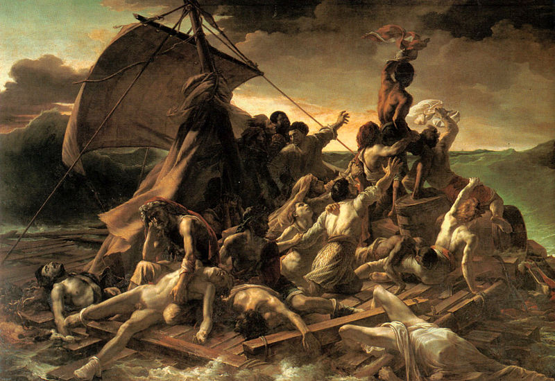
Girl with a Pearl Earring Johannes Vermeer

We left off last week, in Art and the Brain Part 1, addressing the concept of ambiguity in art. In researching Semir Zeki’s ideas about this I found the following:

 “One of the primordial functions of the brain is the acquisition of knowledge. The apparatus that it has evolved to do so is flexible enough to allow it to acquire knowledge about unambiguous conditions on the one hand (colour vision being a good example), and about situations that are capable of two or more interpretations, each one of which has equal validity with the others. However, in the latter instance, we can only be conscious of one interpretation at any given moment. The study of ambiguity thus gives us some insights into how activity at different stations of the brain can result in a micro-consciousness for an attribute, and also tell us something about interactions between different cerebral areas that result in several potential micro-conscious correlates, though only one predominates at any given time. Finally, the study of ambiguity also gives us insights into the neurological machinery that artists have tapped to create the ambiguity that is commonly a hallmark of great works of art.”

And what is this ambiguity? Zeki’s surprising clarification: “It is this that led me to offer a neurological definition of ambiguity, namely it that it is not vagueness or uncertainty, but rather certainty, the certainty of different scenarios each one of which has equal validity with the others. There is no correct answer, because all answers are correct. Schopenhauer wrote, ‘‘. . . through the work of art, everything must not be directly given to the senses, but rather only so much as is demanded to lead the fancy on to the right path. . . " Voltaire has very rightly said, ‘‘Le secret d’^etre ennuyeux, c’est de tout dire’’ [the secret of being boring is to tell everything]. But besides this, in art the best of all is too spiritual to be given directly to the senses; it must be born in the imagination of the beholder, although begotten by the work of art. It depends upon this that the sketches of great masters often effect more than their finished pictures.’’

In other words, artists might allow the viewer to “finish the image”. As in the above Vermeer painting - often cited by Zeki as an example - give viewers the opportunity to have their own experience and draw their own conclusions. Is she turning towards us, or turning away? About to smile, or just stopping smiling?

 The question for the artist wishing to provide this for the viewer might then become, how to decide what is enough information, where to draw the line on definition, what level of contrast indicates ambiguity, the nuances of vagueness? Does it come down to intuition, trial and error, experience?What are your thoughts? Do you think ambiguity is essential? If so, do you think this is a cultural leaning, or something inherited through nature?

Monday, August 27, 2012

Art and the Brain, Part 1

Trace in the Sky  © 2012 Katherine Kean 
oil on linen 30 x 40 inches
Neuroesthetics is a subject that I've long had an interest in so, I was pleased to have the opportunity recently to attend a presentation about Art and the Brain, lead by researcher and writer Erik Nemeth, that took place at Cassandra Tondro’s home. In his presentation, Erik draws upon the work of Semir Zeki about neuroesthetics, a relatively new science that explores how the brain perceives pleasure.

The artists present seemed to be relieved to hear Erik say that artists intrinsically understand perception without having to know the biology of how our eyes and brains work and that the study of neuroesthetics has validated the artistic approaches used throughout history for conveying expression and meaning.

From the work presented by the group of artists present he chose one from each artist to discuss and offer comments. As he approached a piece Erik would explain how he was seeing.

Often the first thing he noticed was contrast, or lack of contrast, that would draw the eye, as well as what associations an artwork might have for him. It is natural for the brain to look for associations - to look for something that it recognizes or holds meaning.

 For the painting above he mentioned that to him, the forms and associations came slowly because the painting is low in contrast overall and without large color differences – almost monochromatic with most of the color falling into one end of the visual spectrum.

 He also explained how the blue helps to create a feeling of great distance, that our brains automatically place blue in the background as we are used to seeing it in the sky. He mentioned that what contrast there is coincides with an intersection of form and he felt that created a sense of reassurance. The vagueness and darkness of the outer areas then felt less threatening.

He spoke about how this vagueness adds to the ambiguity or mystery. I'll follow up on that in the next post.

Monday, August 20, 2012

Home Stretch

Katherine Kean, triptych, original oil painting, orange, red, trees
Branches triptych work in progress ©2012 Katherine Kean
oil on linen 8 x 8 in. each panel

I'm looking forward to completing the triptych shown above soon. When I get a chance, I find it's helpful for me to step back and look at work as a photo. I see things - overall patterns and suggestions that I'm not as likely to see on the easel where I'm focused more on details. It's helpful to get a look before it's too late to incorporate what I can learn from this perspective.

It's been challenging to find painting time this summer - a hazard for me as soon as the weather turns nice! Plus, I've had so many other studio projects happening, everything from re-photographing my current inventory for high resolution display to adding prices to all the work on my website. It is all getting done and for that I can thank the latest heat wave that has made it too hot to be distracted by the garden.


Monday, August 13, 2012

Pinterest Collections as Focus for Inspiration

Have you ever noticed how your Pinterest Art Boards can help to define your focus? That's happened for me. Here is a recent screen shot of one of my Art Pin Boards where I pin the images of other artists' work that I am attracted to, admire, or feel inspired by:


Looking at this I become aware that I am attracted to neutral and warm colors, golds and some red.  I always knew there was a lot of blue in my work and although I often under paint in gold or orange,  warm colors are not something I automatically reach for.

I see certain composition ideas repeating: strong vertical and diagonal lines, a central burst of light that radiates out, as well as a leaning toward a formal structure, balanced by amorphous or flowing shapes.

I tend to think first of subject matter or mood when thinking about art, but without that basis I see the abstract qualities of art I am attracted to, how I like for the canvas to be divided, what the shapes and colors are, whether contrast is strong, or edges sharp or soft and so on.

I'm sure that each person's boards function differently for him or her, but I was startled by how clearly this one became a snapshot of my current aesthetic preferences. Do you have any Pinterest boards? If so, what have your collections shown you?


Monday, August 06, 2012

Two Drawings From Cape Cod

Katherine Kean, Cape Cod, Chatham Beach, drawing, graphite, clouds, atmosphere, mood
Cape Cod, Chatham Beach sketch Katherine Kean
Here are a couple of drawings inspired by a recent trip to Cape Cod. The sky was very hazy and soft, but through the haze I could barely make out massive cloud shapes. There is something about the soft shapes and scant beach grasses and the people looking so tiny in the distance that I like to paint.

Katherine Kean, Cape Cod, Chatham Beach, drawing, graphite, clouds, atmosphere, mood
Cape Cod, Chatham Beach sketch Katherine Kean
I was not imagining the clouds. Later on a thunderstorm blew in. Everything darkened and then it poured. The temperature up until then had been in the 90s and it dropped about 30 degrees. Ah, thank you rain!

Monday, July 23, 2012

Can artwork make you cry?

Has a work of art ever moved you to tears? That's a question that I asked last week while quoting James Elkins, author of Pictures and Tears: A History of People Who Have Cried in Front of Paintings. Some interesting responses motivated me to post this poll about artwork and emotions. Besides tears, does artwork ever make you laugh, feel excited, angry, frightened, confused, dizzy...? Share your experiences in the poll below or in the comments.

When I saw the painting below at the Louvre I felt dizzy and seasick. The large scale - about 16 by 24' and the strong diagonal lines tipping toward the viewer added to the sensation, as did the color.

 The Raft of the Medusa Jean Louis Theodore Géricault
Join the discussion in the comments here or on my Facebook page and post there any artwork that has given you a strong emotional response.

What emotions have you experienced while viewing art?

Monday, July 16, 2012

What Are You Reading This Summer?

My summer reading list includes wit, humor, and drama and some conversational topics to last well into the rest of the year.


  Michael Findlay entertains while looking at the value of art through three defining categories; investment value, social leverage, and aesthetic pleasure. Well illustrated with art and ancedote, he explains how all three contribute to how art is marketed, bought and sold, displayed, and lived with.


 In a series of essays written with eloquence, insight, and humor, Peter Clothier shows us the process of gently dismantling our outer edifice to allow in fresh awareness and genuine inspiration.


 This is for anyone who has an interest in environmental, animal rights, and wilderness issues - assuming that your definition of the wilderness includes the animals that inhabit and to some extent sustain it. Aren't all three interconnected? This book also appeals as a well written drama that brings to light problems with how terrorism has been currently defined and the impact that has on all of us and the resulting limits to our freedom and expression.

Let me know what you're reading.

Monday, July 09, 2012

Creation is Subtraction

Katherine Kean, original oil painting, dark blue, black, clouds, atmospheric, contemporary, luminous
Winds Around You ©2012 Katherine Kean
oil on linen 30 x 30 inches


“Creation is not capricious or random addition; it is intelligent and selective subtraction.” The God Theory: Universes, Zero-Point Fields, and What's Behind It All, Bernard Haisch

 I’ve always thought of the act of creating something as making something from nothing. As in, there’s a blank canvas in front of you and you fill it up with paint to make a painting. While reading Bernard Haisch's, The God Theory, which examines the intersection of science and spirituality,  I’ve learned a new way to look at creating that makes a lot of sense.

Creating is about filtering and selecting from everything. Our brains constantly filter information, and it’s a good thing, because otherwise there would be so many sensations and associations that it would be overwhelming to experience. So, through life we learn to sort out and filter out whatever we perceive as not important.

 The act of creating takes the filtered bits and brings parts of them together, allowing for new associations and fresh perceptions, although nothing new is really made. It just seems that way because the new format lets us experience it as if we’ve never seen it before.

  “The esoteric traditions tell us that creation by subtraction is one of the fundamental truths underlying reality. Put in terms that relate to the God Theory, these traditions teach that creation of the real (the manifest) involves subtraction from infinite potential.”

 So it's a about choices and preferences and making selections. An analogy of the process that Haisch uses in his book is of a projector and film; the light of the projection bulb is the source of all that is and the film is the filter that subtracts from the light:

  “The white light is thus the source of infinite possibility, and you create the desired image by intelligent subtraction, causing the real to emerge from the possible. By limiting the infinitely possible, you create the finitely real.” 

Pretty cool to think about, isn't it?

   "You cannot experience yourself as what you are until you encounter what you are not.”


Monday, June 25, 2012

Back to Go

Center Panel Triptych work in progress ©2012 Katherine Kean    
I've worked my way back around to this triptych. I started this several months ago and had to put it aside to focus on other work. You can see parts of the under painting in this post, and the triptych in progress below.
Triptych work in progress  ©2012 Katherine Kean
This painting is inspired by El Matador State Beach - one of those places that I've been motivated to paint again and again. It's a beautiful beach, as are many on the California coast, and unique in character, as they all are. This one seems to have that golden light set off by the drama of the rock formations, very different from the coastline further north.

Although El Matador is not on the list for closure, 70 or so other state parks are. This represents about 1/4 of all of our state parks and will affect residents and tourists alike, as well as many local businesses that serve park visitors. If you are planning to visit any California State Parks this summer you may want to check this map of planned closures or click here to learn more about it.

Bolton Hall Museum Gift Shop

The Bolton Hall Museum Gift Shop   is a great place to do your holiday shopping! Carrying a wide range of unique items, all are created l...