I set some time aside this weekend to look at the 2007 Art/New York No. 62 DVD I picked up at April Gornik’s exhibit.
In this video she talks about her road from conceptual artist to landscape painter. She talks about how scale is important to her work and the idea of making the work a size to include a human body rather than showing people within the paintings. She goes on to say where some of her inspiration comes from; her own and other's photographs, from novels, and from imagination; as in following an imaginary waterway. She also discusses the perspective of her work, her intuitive way of working, and how her work differs from the Luminist painters to whom she is often compared. There are some clips of her working in the studio: I thought it was interesting to see her working over the red underpainting for one of her blue toned cloud/seascapes.
Other interviews in this DVD about April Gornik are with art critic Donald Kuspit, curator Dede Young, and gallery owner, Renato Danese.
Here is an excerpt:
While looking around for the link I found another, more recent clip for you from New Art TV:
Monday, June 29, 2009
Friday, June 26, 2009
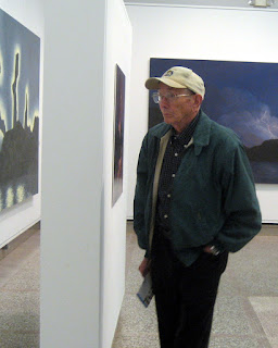
April Gornik's Luminous Landscapes
There are several reasons why I chose to take such a long journey to see this exhibit. I've always felt an affinity with April Gornik's work and have seen her work in magazines, books and online, but I had never seen her work in person, so I had no real sense of the scale or texture or what the brushwork might be like. Also, this exhibit includes work covering a timespan from 1987 to 2009.
In person the paintings reveal some layering in the broad areas where sections of color below show through and influence the top layers. Often in photographs of artwork dark areas of paint seem to read as black, but I saw a great variety of color in the darks including dark blue greens and yellow greens. Another observation was of the slightly built up texture in the foregrounds. I found the brush strokes wonderfully loose and free in many areas, which was somewhat unexpected as I had been interpreting her rendering of forms as being more tightly painted. There was as well as a nice combination of soft and defined edges overall. The scale of the work - all are roughly between 5 to 6 feet high and 6 to 10 feet wide - gave me the feeling that I was looking out of a very large window, or standing before the actual landscape itself, depending on the angle.
Some reviews state that there are 13 paintings in the exhibit, however I counted 12. There was also a large photograph of April, taken in her studio by her husband, Eric Fischl.
The paintings included in the exhibit:
1. Fresh Light 1987
2. Mirror Lake 2004
3. Suspended Sky 2004
4. Lightning at Twilight 1993
5. Turning Waterfall 1997
6. Red Desert 2008
7. Field and Storm 2004
8. Sun, Storm, Sea 2005
9. Storm at Sunset 2000
10.Rising Moon 1991
11.Twilight Dawn 2009
12.Marsh Waterway 1998
Twilight Dawn is the most recent. Just finished in January this is the first time it has been exhibited.
Five of the paintings can be viewed at the Heckscher Museum's website.
Benjamin Genocchio review in New York Times: An Eye For Landscapes That Transcend Nature
Oh That's Mine! Conversation with Robert Ayers
Perusing the exhibit:
The Luminous Landscapes of April Gornik
May 2, 2009 - July 5, 2009
The Heckscher Museum of Art
2 Prime Avenue
Huntington, New York 11743-7702
In person the paintings reveal some layering in the broad areas where sections of color below show through and influence the top layers. Often in photographs of artwork dark areas of paint seem to read as black, but I saw a great variety of color in the darks including dark blue greens and yellow greens. Another observation was of the slightly built up texture in the foregrounds. I found the brush strokes wonderfully loose and free in many areas, which was somewhat unexpected as I had been interpreting her rendering of forms as being more tightly painted. There was as well as a nice combination of soft and defined edges overall. The scale of the work - all are roughly between 5 to 6 feet high and 6 to 10 feet wide - gave me the feeling that I was looking out of a very large window, or standing before the actual landscape itself, depending on the angle.
Some reviews state that there are 13 paintings in the exhibit, however I counted 12. There was also a large photograph of April, taken in her studio by her husband, Eric Fischl.
The paintings included in the exhibit:
1. Fresh Light 1987
2. Mirror Lake 2004
3. Suspended Sky 2004
4. Lightning at Twilight 1993
5. Turning Waterfall 1997
6. Red Desert 2008
7. Field and Storm 2004
8. Sun, Storm, Sea 2005
9. Storm at Sunset 2000
10.Rising Moon 1991
11.Twilight Dawn 2009
12.Marsh Waterway 1998
Twilight Dawn is the most recent. Just finished in January this is the first time it has been exhibited.
Five of the paintings can be viewed at the Heckscher Museum's website.
Benjamin Genocchio review in New York Times: An Eye For Landscapes That Transcend Nature
Oh That's Mine! Conversation with Robert Ayers
Perusing the exhibit:

The Luminous Landscapes of April Gornik
May 2, 2009 - July 5, 2009
The Heckscher Museum of Art
2 Prime Avenue
Huntington, New York 11743-7702
Wednesday, June 24, 2009
Long Island Road Trip
After I had made plans to fly back east for a long overdue visit with my parents I found out that one of my favorite artists, April Gornik, is having an exhibition in Long Island. On a whim I googled the directions from Cape Cod to the Heckschler Museum where her work is showing. According to the link it would be a mere 255 miles taking about 4 and a half hours.
I've never seen any of Gornik's paintings in person so this seemed like a great opportunity and 4 1/2 hours isn't too much of a drive, right? I invited my parents to come along if they wished, or not, if it seemed like just too long in the car to see a few paintings by an artist they hadn't heard much about. To my delight they decided to go - lucky for me, because it actually turned out to be about a six hour trip each way, partially due to construction and stops. My dad is an excellent navigator which made it much easier on me as the driver.
For the return trip we drove to the end of Long Island and took the ferry to New London, Connecticut. It was my first time on a car carrying ferry and it turned out to be a relaxing way to go. The ferry ride just about breaks the trip in half and gives an opportunity to relax and have a bite while enjoying the views.
Photos taken from the car on Long Island:


Getting on the Ferry:


I'll post my thoughts about the exhibit on Friday.
Monday, June 22, 2009
Cape Cod Marshes
I spent last week visiting my parents in Cape Cod. They happen to live near the Great Marsh, which is the largest continuous stretch of salt marsh in New England. Indulging my love of marsh landscapes I took the opportunity to have a look. They were kind enough to point out many views off the beaten path that I might not otherwise have found.

The photo above is of a boardwalk in Sandwich. The boardwalk is 1350 feet long. Although you can't see it here there are many boards embellished with carved names and messages that have been donated to replace about 1700 planks destroyed by hurricanes.
During one of our marsh walks we observed what was probably an osprey in a nest raised up on a pole in the marsh.
It was cloudy almost all week with the sun breaking through just often enough. It made for some beautiful stormy skies - just my kind of weather.

We also took a road trip to Long Island to see April Gornik's exhibtion at the Heckschler Museum, which I'll post about later on in the week.
Thursday, June 18, 2009
Just My Type

Do font choices reflect personality?
I know I have associations about certain fonts. In general fonts with serif seem more stable and a sans serif more casual to me. And for some reason Helvetica reminds me of trains, highways, and airports.
I’ve read that people who choose Courier may be considered conformists, that Times (the default type on Word documents, I believe) is considered to be very traditional and Times New Roman is a compromise between tradition and modern, while Georgia supposedly has more of a “rock chick” feel - although I’m not at all sure what is meant by that. There are fonts that I know I feel like I can take less “seriously”, as if the words they are writing are just joking around. Other fonts seem to be trying too hard.
Lexmark Printers apparently commissioned psychologist Dr. Aric Sigman to write The Psychology of Fonts. You can read more about that in this article: The Font of All Personality.
Font Marketplace has a type selector. You can choose type based on a specific project such as your resume or Valentine’s Day or by category: serious or historical or fun.
Pretty cool I think, with a type preview section. I might like to back there again.
Related Posts:
Before and After : Reworking the Look of My Blog
Tuesday, June 16, 2009
5 Ways to Avoid Toxicity When Using and Buying Art Materials

Lightfall IV 40 x 18" oil on linen
© 2006 Katherine Kean
© 2006 Katherine Kean
This topic has been on my mind a lot lately and came to the forefront again with my recent solvent concerns during the direct heat termite treatment. I have gradually stopped using some of the most dangerous substances, like turpentine. Here are some more things that I do to avoid exposure:
1. Use gloves
2. Don’t keep any open containers. I mix my mediums with any thinner in a squirt bottle that stays capped when not being used.
3. Gamsol instead of OMS. More expensive yes, but has a higher flashpoint and lower evaporation rate which means there are a lot fewer fumes in the air to breathe in.
4. All leftover solvents, mediums, and brush cleaners are taken to the hazardous material disposal facility. Nothing goes down the drain to end up in the ocean or fresh groundwater through the sewer system or by seeping through the soil.
5. Any leftover paint is allowed to dry before disposal, also to prevent contaminating water supplies through seepage. Oil paint is expensive so I don’t allow much waste. I put out tiny amounts on the palette. If there is any left when I am done painting I mix it all together to get a good gray to paint the edges with.
In addition certain manufacturing companies are known to handle materials responsibly. Among them are Gamblin and M. Graham.
Here is an article with more safety tips for artists.
Here is Gamblin on Studio Safety and Solvents.
Related Posts:
If You Took All the Pigments...
Brush Cleaning With Safflower Oil
Thursday, June 11, 2009
Ten Highlights From My Dream Resume: A Surrealist Game

Tattered Fugue 32 x 24" oil and pigment on canvas
© 1999 Katherine Kean
© 1999 Katherine Kean
Like Doodling, writing a Dream Resume is one of the Surrealist Games. The point of the Surrealist Games is to access inspiration through the rich source of your subconscious. The idea of the dream resume is to chronicle your dream activities and accomplishments as you would in a waking life resume. I love dreams and remember lots of them so I find this a fun process to do.
Here are some highlights from my dream resume:
1. I flew, under my own power of course, to California from my home in Massachusetts to visit the Wizard of Oz - as it turns out the wizard is a psychotherapist in Beverly Hills.
2. I willed fishcakes to fall from the sky to feed the crowd at my pool party. Almost immediately after this I willed cats to appear and eat all the leftover fishcakes.
5. I worked for a long time and in many dreams for the Head Chef at a resort. It was my job to decorate all the cakes. Lots and lots of cakes. I must admit that I often strayed from my cake decorating duties to participate in other adventures.
11. I saved an amusement park car that had errantly left the track and flown off into the sky by swooping down from above and guiding it gently to safety with my hand – a la Superman.
3. I served appetizers to a group of friends at a party near the ceiling. We were all floating around up there.
818. I drove my car from the backseat. I included this because I was so good at it and seem to do it often.
32. I won an award. I don't know what the award was for, but both Meryl Streep and Goldie Hawn were in the front row of the audience, smiling and applauding.
11. I climbed a clock tower to an amazing other world.
5. I graduated from an esoteric study course, I know because my transcript was signed off by the Elohim.
10. I was elected vice president to a student council in Africa. I couldn't be president because I hadn't been invloved in enough charities.
I didn't include some of the more mundane occupations I often find myself involved with in dreams.
I’d love to hear about any of your dream resume items that you'd like to share.
Related Posts:
Red and Blue
Dream Scaffolds
Tuesday, June 09, 2009
Lava Haze - Work In Progress

Work In Progress 10 x 8" oil on canvas
© 2009 Katherine Kean
Here is another new painting just underway - another image from Hawaii. I went last fall and got to see some of the volcano’s activity. It began gushing steam and gas about a year ago – representing the first eruption since 1982. In the fall some people saw flames coming from the vent and geologists have found lava rocks thrown up onto the crater floor.
Unlike the Fumerole coming directly from the vent, this is a steam plume caused when lava flows over land and through lava tunnels to eventually exit into the ocean. The plume contains a mixture of hydrochloric acid and concentrated seawater that is created when lava reacts with seawater. This mixture is known as laze (lava haze).
Unlike the Fumerole coming directly from the vent, this is a steam plume caused when lava flows over land and through lava tunnels to eventually exit into the ocean. The plume contains a mixture of hydrochloric acid and concentrated seawater that is created when lava reacts with seawater. This mixture is known as laze (lava haze).
Friday, June 05, 2009
The Rock Pool at Malibu Creek State Park - Last Chance to Visit?*

Another location with a water feature, this one is up in the hills. The surroundings may look a little bit familiar to you and that could be because this is where the TV series M*A*S*H was shot. Before this was a state park the land was partially owned by 20th Century Fox. A more complete list and history of the park, including some other movies that used this land as a location can be found at the Wikipedia article about Malibu Creek State Park.
There is so much to see here, but one of my favorite spots is the rock pool where I’ve spent many a happy hour painting.
More information about visiting Malibu Creek State Park can be found here.
Malibu Creek State Park
1925 Las Virgenes Rd
Calabasas, CA 91302
(818) 880-0367
*This and many other State Parks are in danger of being closed due to the budget crisis. Among them are some of my favorites such as Pfeiffer Big Sur State Park and Point Lobos State Natural Reserve. The complete list of the 220 planned closings can be found on the Pasadena Star News website.
Related Posts:
El Matador State Beach, Malibu California
Places That Inspire
Cypress Grove, Point Lobos
New Work, Monterey Cypress Trees
Back From Big Sur
Wednesday, June 03, 2009
Termite Treatments, Solvents, and Their Flashpoints

Infini II 30 x 40” oil and pigment on canvas
© 1996 Katherine Kean
I didn’t get much done in the studio Monday – instead I had a termite treatment. After much research on the various methods - from orange oil to posion gases - I chose a direct heat treatment applied to the sub area, followed by electricity and borates. The “crawl space” right next to the studio was heated to 175 degrees to kill a recent termite infestation. The day before the treatment I gathered up all the solvents, many of which have low flashpoints*. There is some insulation between the crawlspace and the studio, but I thought better safe than sorry. The direct heat crew thought the same and proceeded to move paintings aside and tarp the studio off from the main part of the house.
The flammable qualities of solvents isn’t something I think about a lot, mainly because my studio is below the house and tends to stay a little bit cooler overall. It’s heaven on those occasional Santa Ana heat wave days in the summer. The rest of the house can easily get into the nineties on the worst days if I am not running the AC. I don’t have a lot of solvents, I’ve switched from using odorless mineral spirits to using Gamsol because it has a slower evaporation rate and I’ve stopped using turpentine altogether. I do still have some leftover in the studio and there was more than I had initially realized.
Below is a list of the flash points of the various solvents I have in the studio:
*Flash Point
The lowest temperature at which a solvent produces vapor in sufficient concentration to create a flammable mixture.
Turpentine 90 degrees Fahrenheit
Mineral Spirits 104 degrees Fahrenheit
Odorless Mineral Spirits 125 degrees Fahrenheit
Gamsol 145 degrees Fahrenheit
I also removed all of my encaustic supplies so that I wouldn’t run the risk of having all the colors fused together at the bottom of the container.
Now my house is termite free and my subarea is sanitized.
Monday, June 01, 2009
Unabandoned Paintings
Last week was fun, but short and full of appointments. With the slightly limited studio time that I had instead of starting on new work I brought everything in the studio that is still unfinished a few steps closer to becoming complete. As much as is practical for me, I’d like to finish the whole series all at the same time. The way that has been working out so far is to start three or four paintings each month and then also spend some time working on the almost finished. I like having something to work on in the event that everything else needs some extra drying time or whatever. The overall idea is that this approach will give everything in a planned show a certain element of consistency while also helping me to envision the whole as it comes together along the way rather than finishing one by one while trying to not let the latest piece be more “developed” than the earlier ones.
This month the large canvases that have been sitting in the studio will get started on at last. One is 40 x 60” and the other is 45 x 60”. I had better double-check my paint stock.
Related posts:
Waves Coming to Shore: New Work and Goals
View of Halemaumau Ash Plume
Trace In the Sky the Painter's Brush...
Balls in the (studio) Air
Subscribe to:
Posts (Atom)
Bolton Hall Museum Gift Shop
The Bolton Hall Museum Gift Shop is a great place to do your holiday shopping! Carrying a wide range of unique items, all are created l...

-
 Marsh - Boat graphite on paper 4 x 6" ©2011 Katherine Kean This drawing is being worked into a painting. I may have decided...
 -
 Edgar Allen Poe related artwork, curated by Chuka Susan Chesney and Christie Shinn. The show runs from October 6 - 27th and is part of...
 -
 Another example of a film heavily influenced by fine art is Stanley Kubrick's Barry Lyndon . In this case the film takes inspiration fr...